An identity thatholds up at 16px.
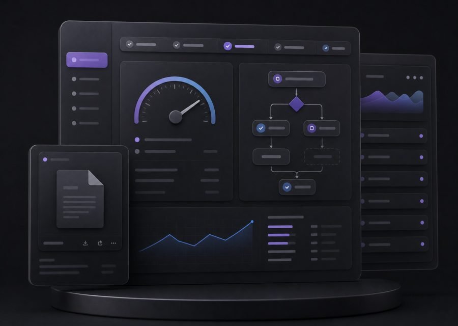
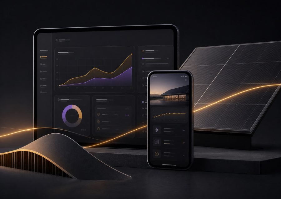
Logo, type, colour and art direction, proven on the surfaces that usually break a brand — dense tables, error states, a mobile nav bar.
Designed againstthe hard cases first.
An identity stress-tested against the awkward surfaces, not just the poster.
Identities fail in production, not in the presentation. So we start with the hardest surfaces: the data-dense screen, the transactional email, the sixteen-pixel favicon, the state where everything has gone wrong.
If the system survives those, the poster takes care of itself. You get the full set of assets plus written art direction covering the cases nobody thinks to ask about.
What youget.
Every item is a deliverable you receive, not an activity we perform.
- Logo system and clear-space rules
- Typographic scale with accessibility baked in
- Colour system tested for contrast in both modes
- Art direction for photography and illustration
- Application across product, web and document surfaces
- Written guidelines and asset library
Before youget in touch.
Rarely the right answer for a business with equity. We will tell you if an evolution gets you ninety per cent of the value for a fraction of the disruption.
Editable source files, exported assets in every format you will need, and the written guidelines — all transferred to your own accounts.
Test the identitywhere it breaks.
A short call is enough to tell whether this is the right piece of work for you. If it is not, we will say so.